full case study
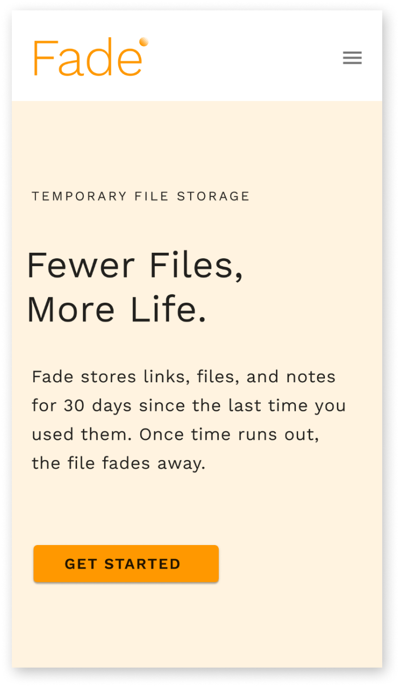
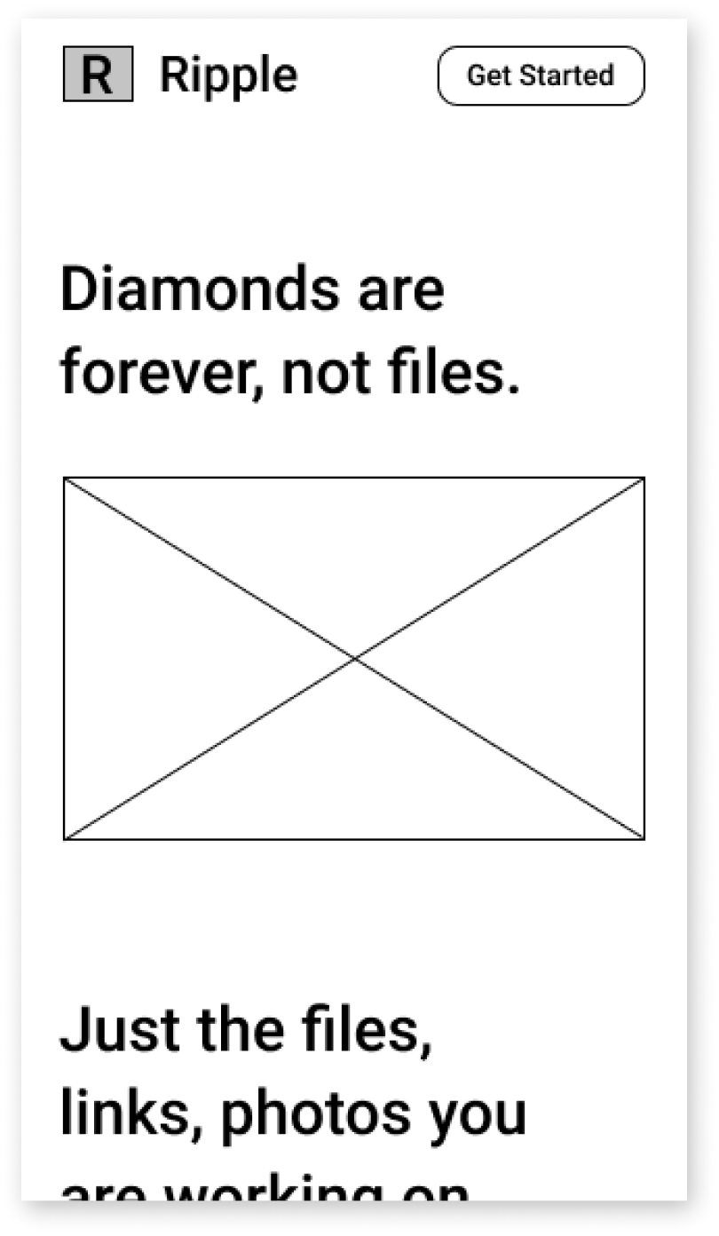
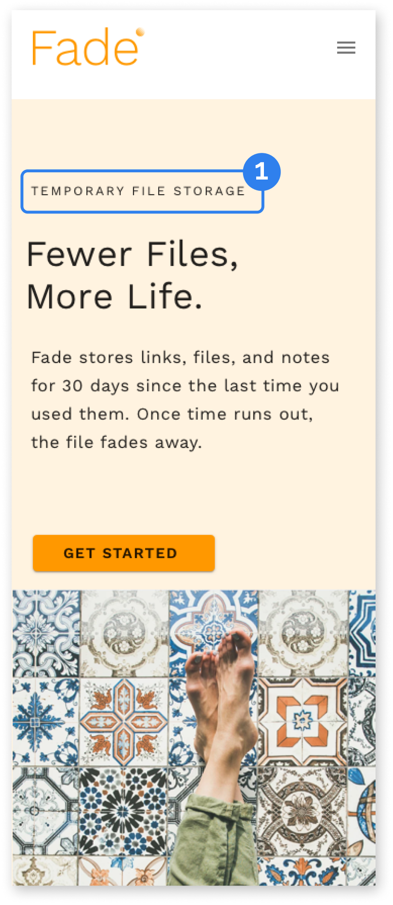
Every app seems to store data forever. When you upload something it sticks with you forever. Fade stores links, files, and docs for 30 days since the last time you used them. If you don’t need it again it’s gone. When your files fade, only what matters remains.
Project Role
UX Design, Visual Design, Branding, Website
Project Duration
6 Weeks
The scenario setup was that I was working at an agency and a new client comes in who wants to build something in the cloud storage space but they don’t know what they want they want to build. They need a path forward.
They knew that they needed to stand out in a crowded market and find something unexplored by current services in order to compete on a large stage.
The first stage was to get a better understanding of the space that we were going to be working in and the major actors. I started with selecting several companies to analyze that covered a wide gamut of offerings in the space. These were companies that had some similarities but represented significantly different approaches to service their users.
competitive analysis
Airtable is a very approachable relational database that is set up like an Excel spreadsheet. Airtable is very easy to collaborate on and can be used for a million and one things. I use Airtable to plan vacations, budget for home renovations, and pretty much anything that works better in list or spreadsheet format.
Collaborative
Easy to use
Data goes stale
Collaborative
Organized
Cluttered

Collaborative
Organized
Messy
One major downside that came out of the competitive analysis on Airtable and the other two companies is that it’s difficult to deal with data that has been sitting around awhile. For Airtable it’s tough to see the age of a record, so if you are storing contacts, for instance, their info may be outdated and you really have to dive deep into a record to piece that picture together.
Trello is also very collaborative and easy to use and is great for organization and visualizing how data moves through the kanban. Usually people have a “done” column where cards go when you have completed all of your tasks and that column tends to stack up with old cards and starts to clutter the board.
Evernote can be used to “save everything” as their branding promises. It’s great for pulling in things from lots of sources and organizing them but can get messy as you use it longer and longer.
These services can get cluttered and more difficult to use the longer you use them. I took that insight and put it in my back pocket for later.
Next, I wanted to see what the users of those services said, so I launched a survey.
user research


That survey showed that 90% were using some sort of cloud storage service for either work or personal use. 75% of respondents said that they used cloud storage to share, save, and organize links, images, and documents.
For the most part, the survey showed that users were happy with these cloud storage services but there were indirect indicators in qualitative sections that pointed to some of the issues that I saw earlier in the competitive analysis: cluttered, tough to find files, tough to share files.
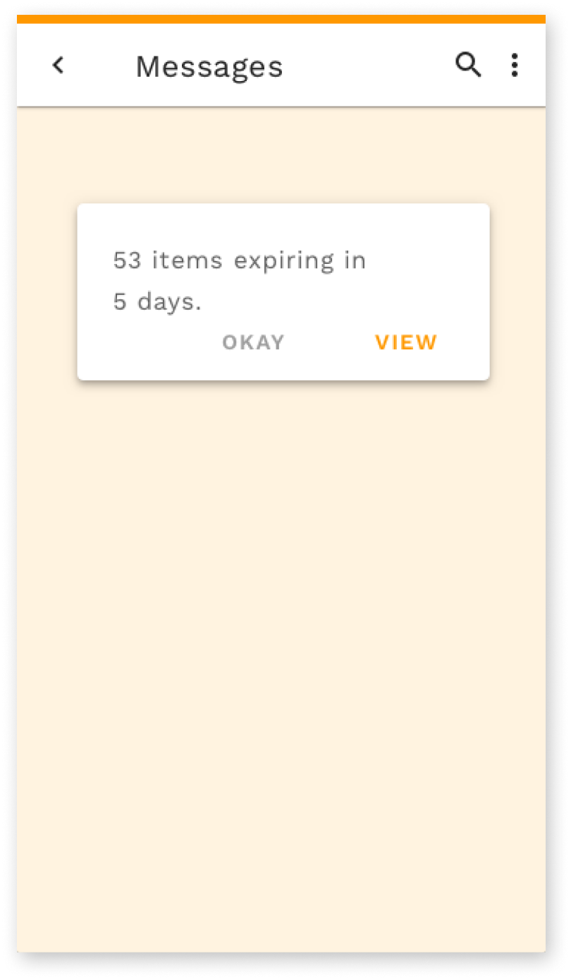
This research pointed towards two very important areas: that collaboration was a central part of all of these services, and that users needed a way to clear out old files that were no longer relevant.
process
The first iteration of the app would focus on these two guiding elements.
There was a long road to move from this initial insight to the first sketches. In order to flesh out these ideas, I looked at who I was building for. I put together the user research into two personas that represented the roles of creator and consumer.
I also developed a list of user stories based on what these users would need to accomplish.
I went back to the companies in the competitive analysis to look at common user flows across their sites and mapped them to what I need to create in this project.
user personas
user flows


initial concept
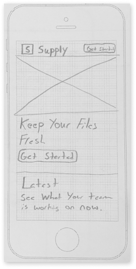
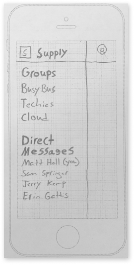
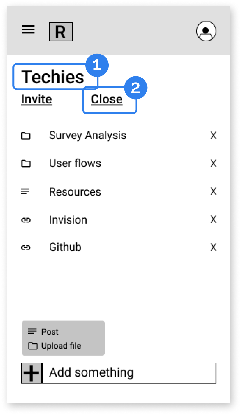
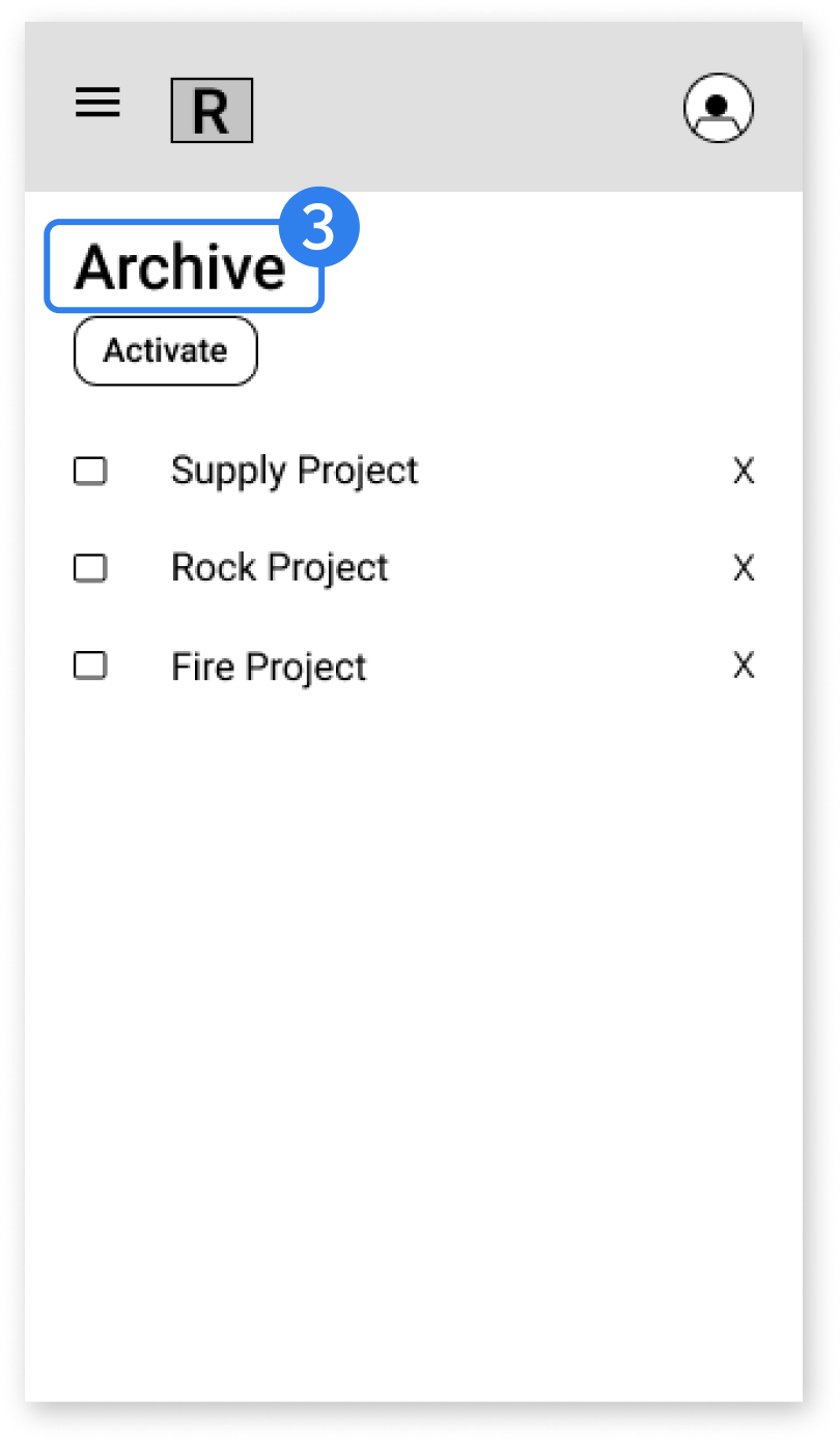
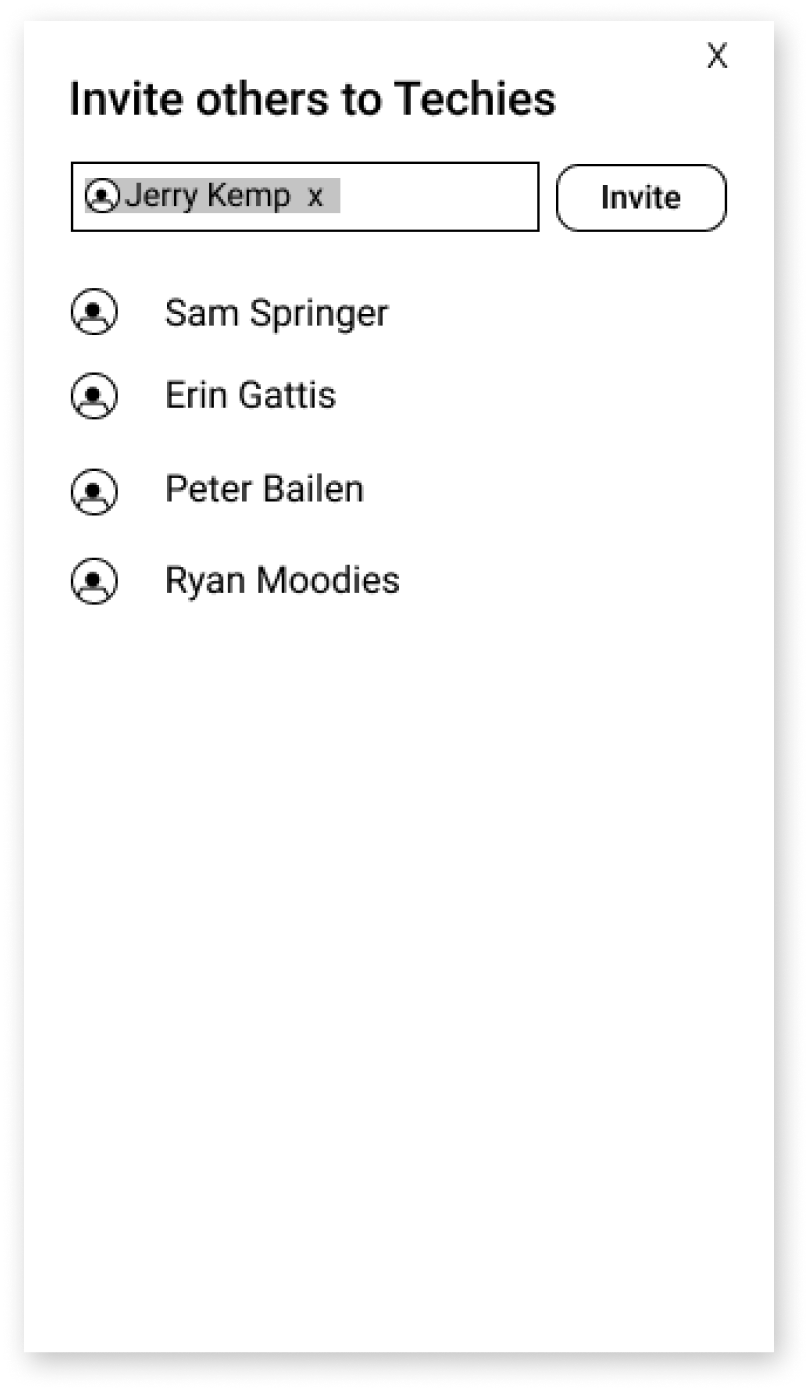
All of these insights and materials went into the 1st concept. I put together paper sketches and clickable prototypes in Invision, so I could test them as quickly as possible with users to see if I was heading in the right direction.
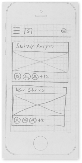
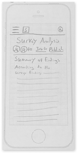
Usability Testing - Round 1
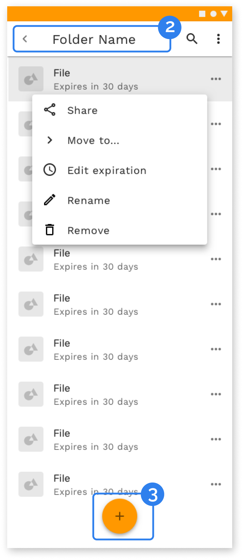
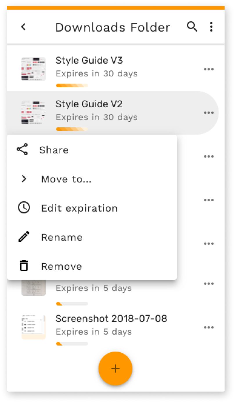
Hierarchy of files and folders is not clear
The terminology of “close” and “archive” is not clear
Users struggled to delete and reopen files
a new direction
The results from the user testing came in and it was clear I bit off more than I could chew with the twin focus on both collaboration and expiration. Instead of enhancing the experience, working on both elements watered down the benefits and made it difficult for users to see how the app worked and would benefit them.
It was decision time. I had to choose one or the other to focus the app on. I went back to the research. Expiration kept coming up as the stronger differentiator. In the user testing, expiration was what also stood out most to users.
I refocused the project on expiration. As I began working on branding, I needed to figure out how to present file expiration as something that would benefit users.
Expiration is usually a negative thing. Your food expires and goes bad. Your gift cards expire and become pointless. I needed the branding to guide me in how to make an app that could deliver a positive experience around expiration.
brand
The brand focuses on expiration as renewal. Sunsets signal the end of something but also the start of a new day. Expiration can be about refreshing and resetting to make room for what matters next.

The brand also functioned as a guide for design decisions to come in both the styling and and the flows.

Fade is about renewal and lightness. Files expires to make room for what matters. Fade should stay out of the way. It should be subtle, receding into the background, and only appearing when you need it.
typography

The typography was about cleanliness, readability, and a logical feel.
The branding combined with user insights led to the 2nd major iteration of the app.
second concept
User feedback on the second version of the app showed that people understood the expiration direction and took to it very quickly. It was much more clear to users after I focused on expiration.
usability testing - round 2
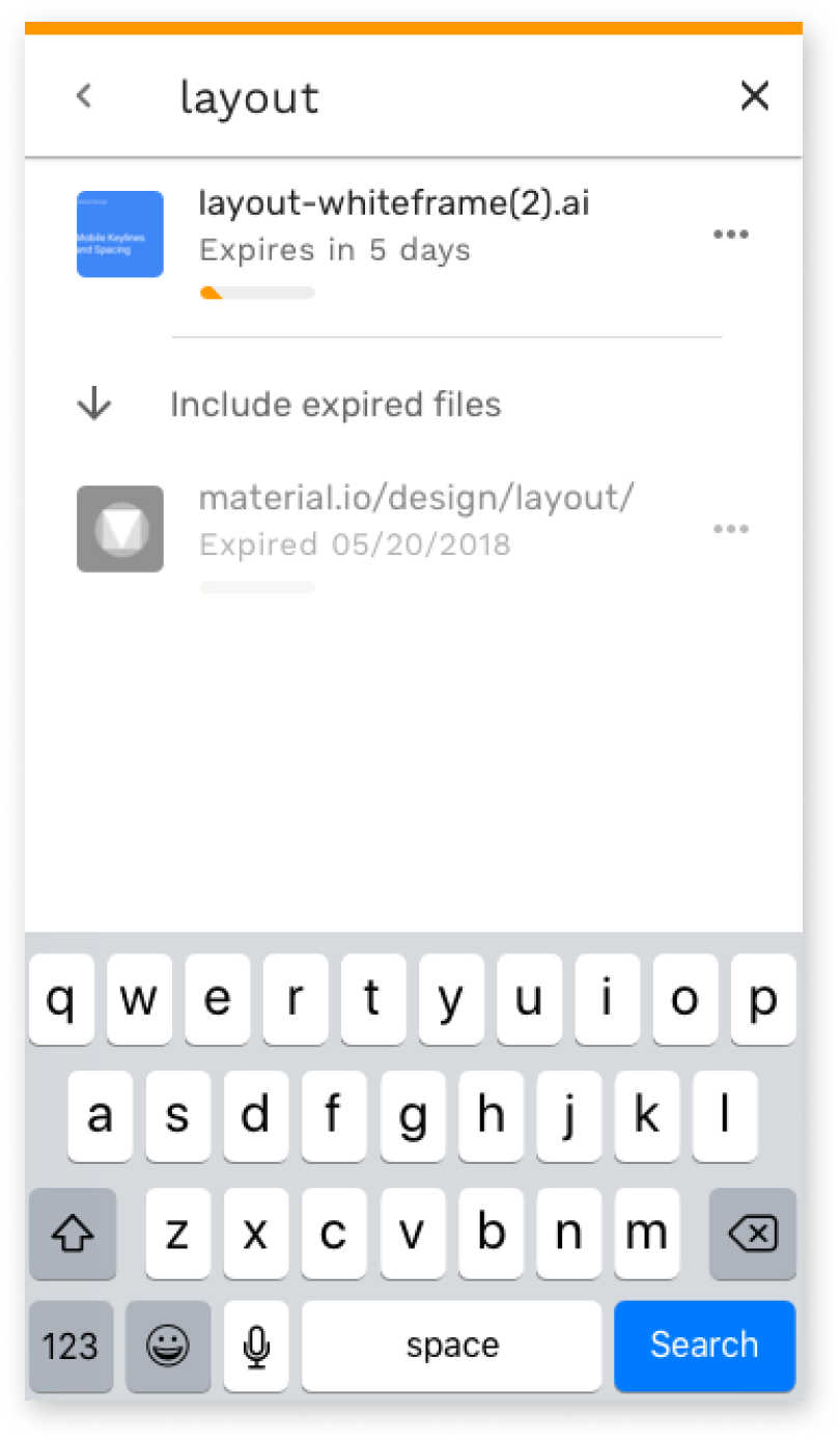
Users didn’t grasp the temporary storage aspect from the homepage
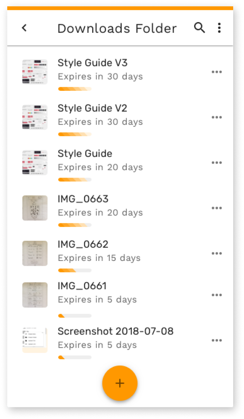
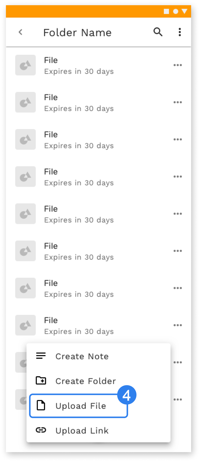
Users understood the hierarchy of files and folders much better
The action button was much easier to understand
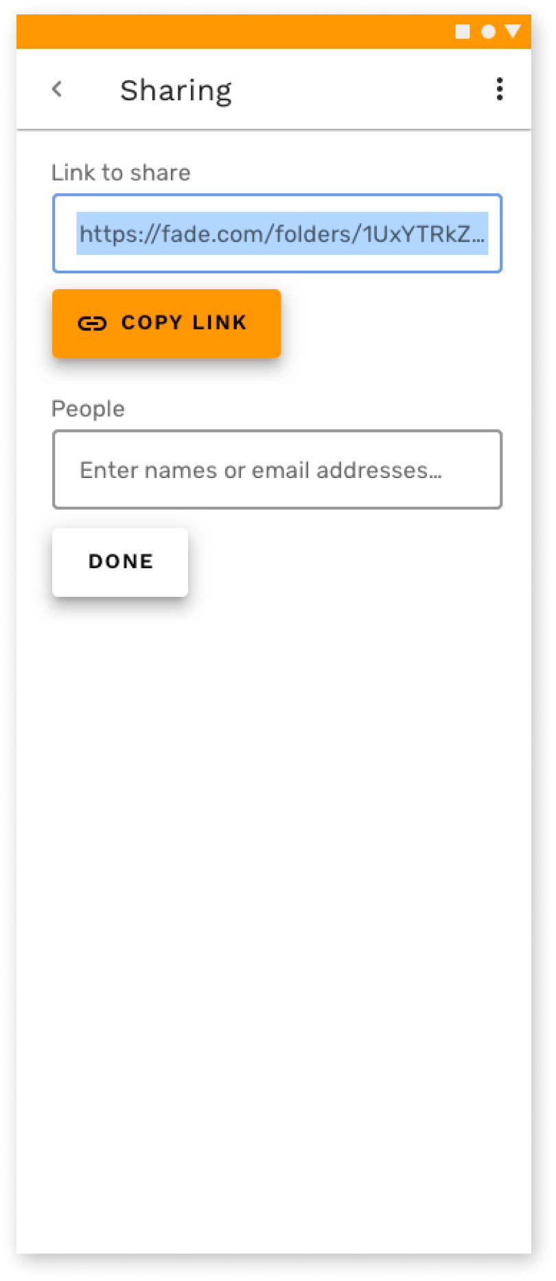
Users moved more slowly through the file upload flow
Even though users could see the value in the app, there were still clear signs that the homepage needed to do a better job of explaining the service and answering important questions before users would sign up and actually start using the app.
I dove into the homepage and added new sections walking through the features and pricing and set up preference tests with users to finalize the homepage.
homepage preference testing
Lifestyle focus
.png)
Logo focus
.png)
launch
The final iteration of Fade focused on improving the landing page to better explain the service and provide a stronger argument for why people should use the app.
lessons
Ultimately Fade was a lesson in the power of rapid prototyping to create and improve a concept over just a few weeks.
Fade evolved greatly from its initial concepts. Early user testing identified that the product was trying to do too much by focusing on collaboration and expiration. That testing focused the product and made it much better. Fade grew with each round of testing as I learned how to make each part of the service stronger.
More Projects


