summary
A public transit agency was facing a challenge where up to seven different bus lines went through a single station and caused confusion among their riders about which bus was theirs and how much time they had to reach the station.
I was tasked with designing a transit app that would help riders see where their bus was and when it would arrive at their station.
Project Role
UX Design, Visual Design, Branding, Website
Project Duration
1 Week
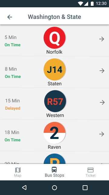
Too many buses arriving at the same station at the same time. Riders could not clearly see which bus was theirs and whether they would have to run to the station in order to catch their bus. According to my competitive analysis, apps like Google Maps and City Mapper are easy to use and compare transit options against each other, but are very broad in terms of audience, so we needed something specific to help experienced riders riding the same buses every day.
Focus on the tools that experienced riders need to solve their immediate problem. Popular transit apps provide a wide array of features for every type of user, but the users really need something a person who rides the same bus along the same route could use, they want just information that’s relevant to them. The BusyBus App helps riders to identify their bus by using the same bus signage that they expect to see on the side of the bus and focused information on arrival times.
quick tour
Familiar signs that match those on the buses.
Clear focus on the details that riders need every day.
More Projects

